

Types of Infographics: 8 Formats and When to Use Each
Why the Type of Infographic Matters Before You Design Anything
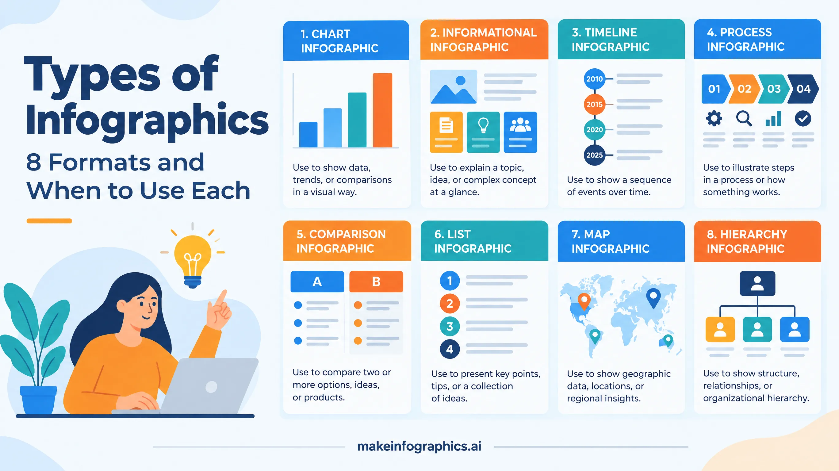
Most infographics fail for a simple reason: the format does not match the message. A designer starts with attractive icons and a color palette, then tries to squeeze a process, a ranking, and a time series into the same canvas. Readers cannot tell where to begin, so they leave. Choosing the right type first fixes this, because each format gives the reader a ready-made mental model. A timeline says "read this top to bottom, oldest first." A comparison says "look across, not down." A checklist says "do these in order."
This guide walks through eight common infographic types, explains what each one is best at, shows a real example from our gallery, and ends with a quick rule for picking the right format in under a minute. If you are new to the whole workflow, start with our step-by-step guide to creating an infographic, then come back here when you reach the structure stage.
1. Statistical Infographics
A statistical infographic turns numbers into a story. It leans on big figures, simple charts, and short labels so the reader can absorb the main finding in a few seconds. This is the most familiar type, and also the easiest to get wrong: too many charts with equal weight produce a dashboard, not an infographic.
Best for: research summaries, survey results, market reports, and annual reviews.
How to do it well: pick one headline number and make it the largest element on the page. Support it with three to five secondary figures, always with the source and year visible. A good example is the global diabetes statistics infographic, which builds the whole layout around a handful of large numbers and a clear citation.
2. Informational Infographics
An informational infographic explains a topic that does not fit neatly into numbers: what a technology is, how a concept works, or what a term means. It usually combines a short headline, a few labeled sections, and icons or illustrations that make abstract ideas concrete.
Best for: explainers, onboarding material, glossary-style content, and awareness campaigns.
How to do it well: limit yourself to four to six sections and give each one a heading, one sentence, and one icon. If a section needs a paragraph, it probably belongs in a blog post that the infographic links to.
3. Timeline Infographics
A timeline infographic arranges events in chronological order along a line, usually vertical for mobile and social feeds or horizontal for presentations. Because time is an intuitive axis, readers understand this format immediately, which makes it one of the safest choices for historical or project-based stories.
Best for: company histories, product roadmaps, industry evolution, and project milestones.
How to do it well: select the five to ten milestones that actually changed something, rather than listing every event. Label each with a year and a single short line. The history of e-commerce timeline shows how a few well-chosen dates can summarize three decades. For a ready-made visual style, try the vintage history timeline template.
4. Process Infographics
A process infographic breaks a procedure into numbered stages connected by arrows or a flow line. It answers the question "what happens, and in what order?" and is the natural format for how-to content, workflows, and life cycles.
Best for: tutorials, manufacturing or supply chain flows, recycling and life-cycle explainers, and internal procedures.
How to do it well: keep the steps to a single sentence each, start every label with a verb, and make the direction of flow unmistakable. A good illustration of the style is the e-waste recycling process infographic, which moves from collection to reuse in six clear steps.
5. Comparison Infographics
A comparison infographic places two or more options side by side so the reader can judge them across the same criteria. It might be a split layout with a shared center line, a table-like grid, or a set of matching cards. The key is consistent structure: every option answers the same questions in the same order.
Best for: product comparisons, "A versus B" decisions, pros and cons, and before-and-after stories.
How to do it well: choose three to five criteria that matter to your reader and resist adding more. Use color to identify each option consistently, and highlight differences rather than similarities. For a data-driven example, see the high-speed rail networks comparison.
6. List and Checklist Infographics
List infographics present a set of tips, rules, or items, often with numbers or checkboxes. They are among the most shareable formats because readers can scan them quickly, save them, and act on them. A checklist adds a sense of progress, which is why this type performs so well on visual platforms.
Best for: best-practice guides, safety information, travel or planning checklists, and quick-reference cards.
How to do it well: group the items into two or three phases, such as before, during, and after, rather than presenting one long list. Keep each item to a few words. The food allergen label-reading checklist follows this pattern, pairing a visual grid of allergens with a short sequence of steps.
7. Geographic Infographics
A geographic infographic uses a map as its backbone, with colors, markers, or labels showing how a value varies by place. Maps are powerful because readers instantly locate themselves on them, which makes regional differences memorable.
Best for: regional statistics, travel guides, distribution of resources, and market footprints.
How to do it well: use no more than five color bands, include a legend that is readable at thumbnail size, and call out two or three standout regions with short labels. Avoid maps when the geography is not the point; a bar chart often communicates a ranking more accurately than a colored map.
8. Hierarchical Infographics
A hierarchical infographic shows structure and levels: an organization chart, a pyramid, a decision tree, or a set of nested categories. It answers the question "what sits above or below what?" and is useful whenever relationships matter more than quantities.
Best for: organization charts, priority frameworks, taxonomies, and learning models.
How to do it well: limit the depth to three or four levels and keep labels short so the structure stays visible. A template such as the corporate org chart template gives you a clean starting layout that you can adapt to your own hierarchy.
How to Choose the Right Type in Under a Minute
When you are unsure, ask what the reader should be able to do after looking at the graphic. The answer usually points to a type:
- "Understand how big or how common something is" points to a statistical infographic.
- "Understand what something is" points to an informational infographic.
- "Understand how we got here" points to a timeline.
- "Know what to do, step by step" points to a process or checklist.
- "Decide between options" points to a comparison.
- "See how it differs by place" points to a geographic infographic.
- "See how parts relate" points to a hierarchical infographic.
If your content seems to need two types, pick the one that serves the main question and mention the second in a single supporting element. A timeline can carry one highlighted statistic, and a statistical piece can carry one short process strip, but a poster that fully attempts both usually does neither well.
Common Mistakes When Picking a Format
- Defaulting to the statistical format for everything. Not every topic has meaningful numbers. Forcing data into an explainer makes it look thin or padded.
- Using a map when location is not the message. Readers spend time decoding geography that adds nothing.
- Building a timeline with too many events. Crowded timelines become tiny text. Cut anything that did not change the story.
- Mixing criteria in a comparison. If one option is described by price and the other by features, readers cannot compare them fairly.
- Ignoring the channel. Vertical layouts suit Pinterest and mobile feeds, while horizontal layouts suit slide decks. Choose the orientation along with the type.
Pair the Type With the Right Visual Style
Type and style are separate decisions, and getting both right is what makes an infographic feel professional. A timeline in a vintage style feels like a history lesson, while the same timeline in a minimal style feels like a business briefing. Once you have chosen your format, use our guide to choosing an infographic style to match tone to audience. If your piece depends on numbers, the advice in data storytelling with infographics will help you turn them into a narrative instead of a list.
A Practical Workflow for Any Type
- Write the one-sentence message. If you cannot state what the reader should take away, the format will not rescue the piece.
- Pick the type from the list above. Use the questions in the previous section to decide.
- Outline the content. Count the sections, steps, events, or criteria and trim to the recommended range.
- Verify every number. Use primary sources and add the year next to each figure.
- Generate and review. Create the design, check the text for accuracy, and view it at thumbnail size to confirm that the structure is still clear.
Create Your Own Infographic
You do not need design software to try each of these formats. Describe your topic and the structure you want, pick a style, and generate a first draft in minutes. Try the same content as a timeline and as a checklist to see which one makes your message clearer. When you are ready, create your infographic with MakeInfographics.ai and turn your next idea into a visual people will actually finish reading.
Create Your Own Infographic
Apply what you learned and generate a professional infographic with AI in seconds.
Start Creating — FreeRelated Articles
How to Create an Infographic: A Complete Step-by-Step Guide
Learn how to create a professional infographic from scratch. A step-by-step guide covering research, structure, design, and publishing.
Guides10 Best Infographic Examples That Drive Engagement in 2026
Discover 10 infographic examples that drive engagement in 2026. Learn what makes each one effective and how to apply these patterns to your own content.
GuidesHow to Use AI to Make Infographics in 2026
A practical guide to using AI infographic makers in 2026. Learn prompting techniques, workflow tips, and how to get professional results fast.