Japanese Infographics
Zen aesthetics, minimalism
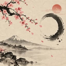
Washi paper textures with sumi ink brush strokes and cherry blossom accents. Brings a meditative, refined quality to wellness, nature, and cultural topics.
Create Japanese Infographic — FreeDesign Principles of the Japanese Style
Best For
- Wellness, mindfulness, and meditation content
- Nature, environment, and seasonal topics
- Cultural content, travel guides for Japan, and cuisine-related infographics
- Luxury wellness brands, spa services, and holistic health practices
Not Ideal For
- Data-dense business reports where every pixel needs to carry information
- High-energy marketing or promotional content
- Technical documentation where precision and density are priorities
Color Psychology
The muted palette of Japanese design — ink black, warm grey, soft pink — creates a calming visual experience that mirrors the content it typically serves. Cherry blossom pink (sakura) is culturally significant, representing the beauty of transience and renewal. In color psychology, muted tones reduce visual stress and create space for reflection, making this palette ideal for wellness and contemplative content where the reader's emotional state matters as much as information transfer.
Typography Guide
Combine a brush-style display font (Zen Antique, Shippori Mincho for Japanese text, or Noto Serif JP) with a clean sans-serif for English body text. The contrast between organic brush strokes and clean modern type creates the traditional-meets-contemporary tension that defines modern Japanese design. Keep text minimal — in Japanese design philosophy, what you omit is as important as what you include. Use generous tracking (letter-spacing: 0.05em) for Latin text to match the spacious feel.
Japanese vs. Minimal: Which Should You Choose?
Both styles value whitespace and restraint, but they come from different philosophical traditions. Minimal is rooted in Western design rationalism (Bauhaus, Swiss Style) — it is clean because clarity is efficient. Japanese style is rooted in Zen aesthetics (wabi-sabi, ma) — it is spacious because emptiness is meaningful. Minimal uses geometric precision; Japanese uses organic imperfection. Choose minimal for business and product content; choose Japanese for wellness, nature, and culturally resonant topics.
 Explore Minimal Style
Japanese Templates
Ready-to-use templates in the Japanese style. Click to customize and generate.
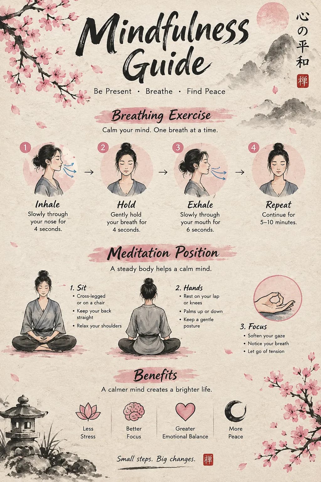
Mindfulness & Meditation
Zen-inspired wellness guide with washi textures and cherry blossom accents. Meditation, breathing, and self-care.
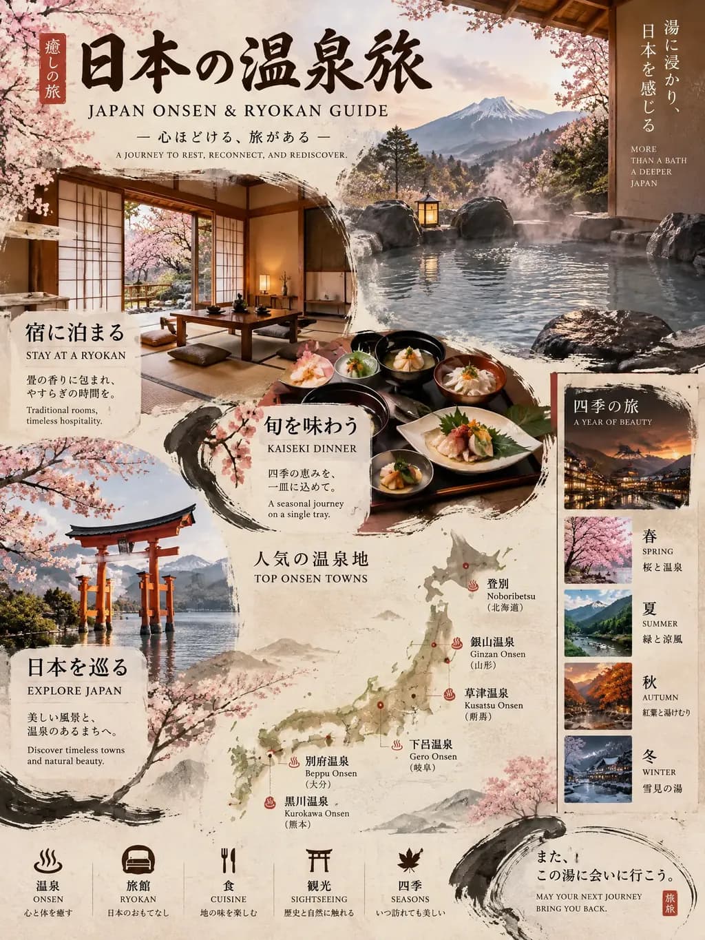
Japanese Ryokan & Onsen Travel Guide
Zen-inspired guide to traditional Japanese inn experiences. Covers top ryokan regions, onsen etiquette, seasonal recommendations, and budget planning for authentic Japan travel.
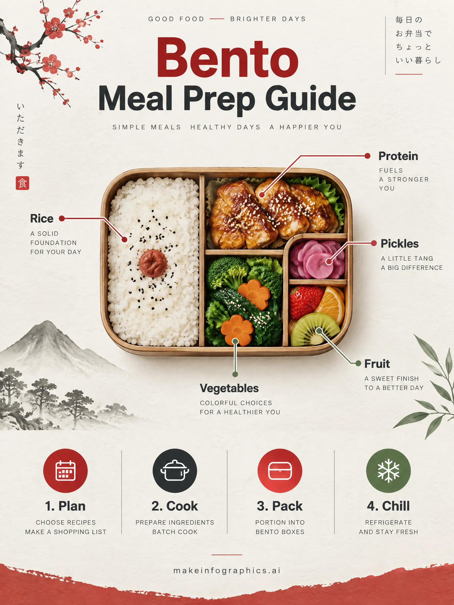
Japanese Bento Meal Prep Guide Template
A calm Japanese-style infographic template for planning, cooking, and packing a week of bento lunches, with a balanced compartment layout and prep timeline.
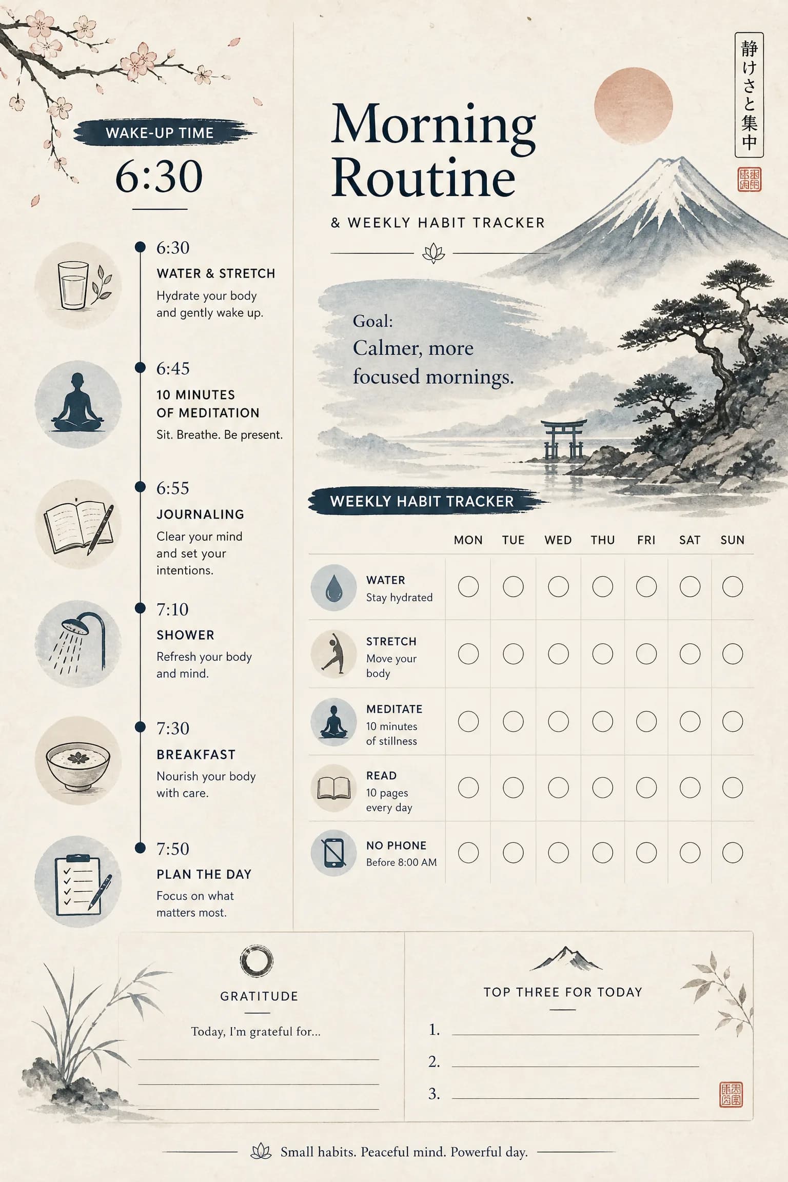
Morning Routine & Habit Tracker
Design a calm morning, then tick off your habits every day of the week. Print the blank tracker or let AI build your routine.
Frequently Asked Questions
Is the Japanese style appropriate for non-Japanese topics?
How does the Japanese style differ from general minimalism?
Create Your Japanese Infographic
Describe any topic, and AI generates a polished Japanese infographic in seconds. No design skills required.
Start Creating — Free