Hand Drawn Infographics
Sketch-like pen & ink
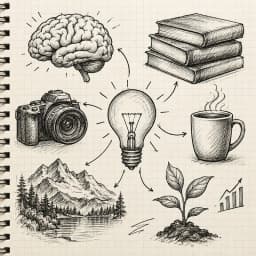
Pen and ink on paper aesthetic with crosshatching and sketch lines. Brings a personal, authentic feel to storytelling infographics, process explanations, and creative content.
Create Hand Drawn Infographic — FreeDesign Principles of the Hand Drawn Style
Best For
- Recipe cards, food guides, and cooking content
- Process explanations and how-to guides where a personal touch builds trust
- Creative portfolios, art-related topics, and craft content
- Personal blogs and storytelling-driven content
Not Ideal For
- Data-heavy corporate reports where precision and formality are expected
- High-resolution photography-centric content (the sketch aesthetic clashes with polished photos)
- Large-scale enterprise communications where brand consistency is critical
Color Psychology
The pen-on-paper aesthetic triggers nostalgia and authenticity — in a world of polished digital content, hand-drawn visuals stand out because they feel human. This is the visual equivalent of a handwritten note versus a typed email. Research shows that hand-drawn elements increase perceived trustworthiness and personal connection, which is why food brands, organic products, and artisanal businesses frequently adopt this aesthetic.
Typography Guide
Combine a hand-lettered or script font for headlines (Caveat, Indie Flower, Amatic SC) with a clean readable font for body text (Lato, Open Sans). The contrast between handwritten and digital type creates a pleasing tension. Size hand-lettered text at least 24px — script fonts become illegible at small sizes. For labels and callouts, a monospaced handwriting font adds authenticity without sacrificing readability.
Hand Drawn vs. Playful: Which Should You Choose?
Hand-drawn feels artisanal and intimate (like a sketch in someone's notebook), while playful feels cheerful and polished (like a children's book illustration). Hand-drawn uses pen textures and organic imperfections; playful uses clean digital shapes and bright pastels. Choose hand-drawn when authenticity and personal touch are the priority; choose playful when friendliness and broad accessibility matter more.
 Explore Playful Style
Hand Drawn Templates
Ready-to-use templates in the Hand Drawn style. Click to customize and generate.
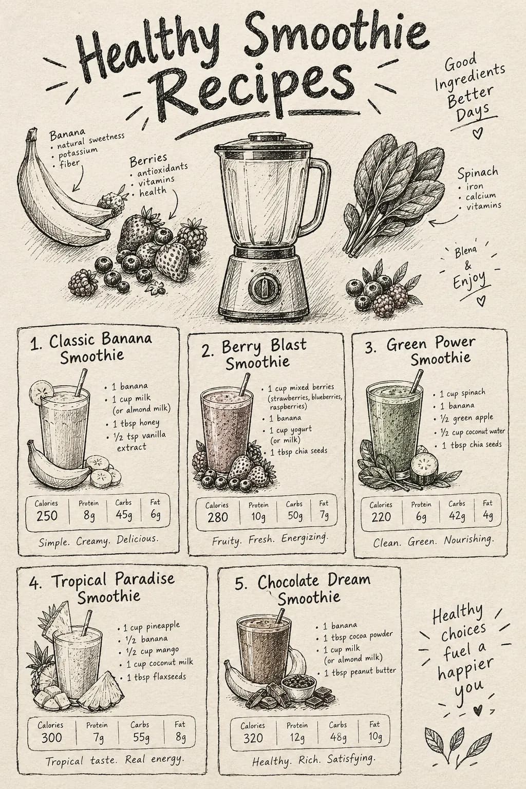
Recipe Infographic
Sketch-style recipe card with ingredients, steps, and nutritional info. Personal and authentic feel.
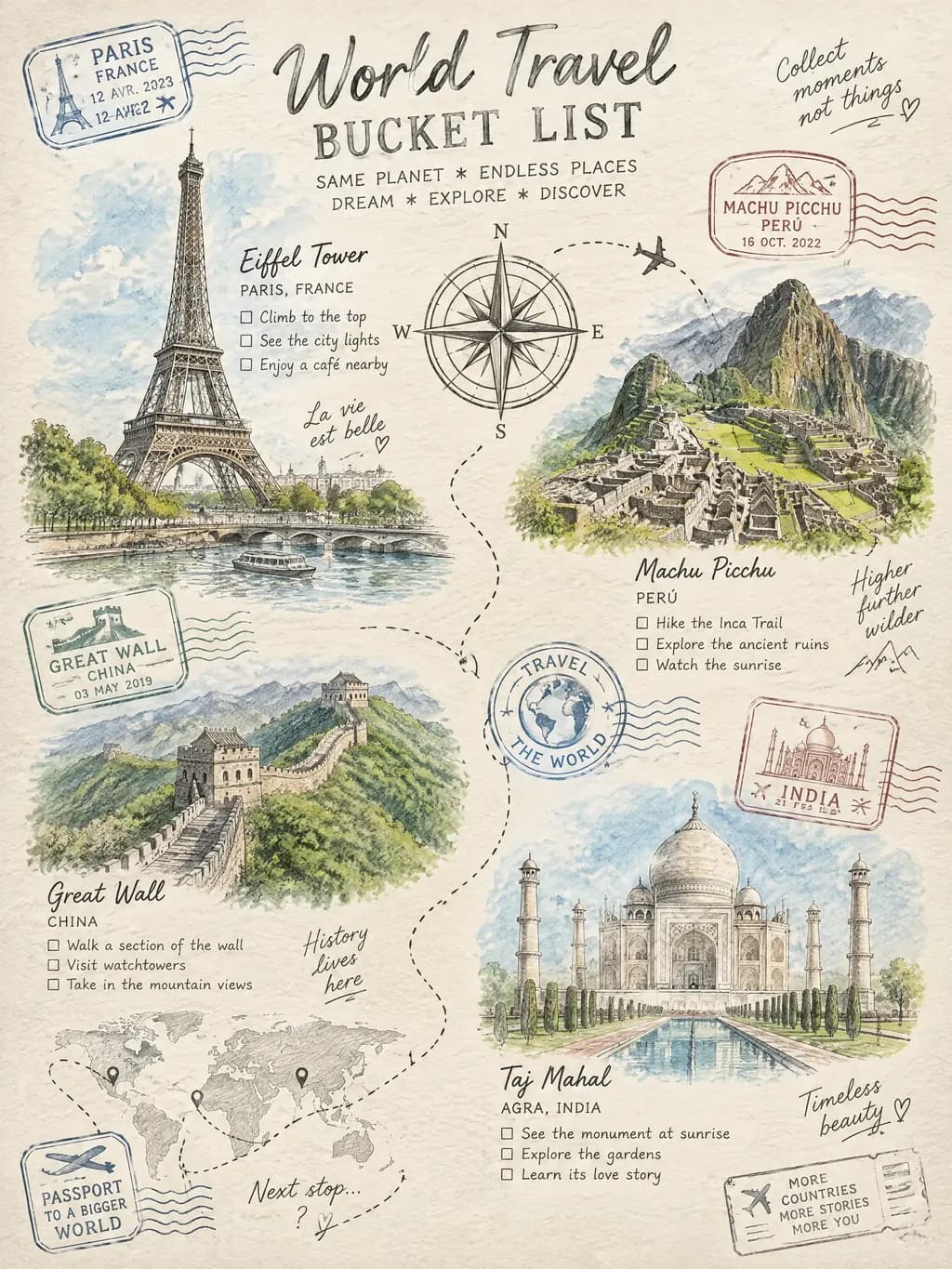
Travel Bucket List Guide
Whimsical hand-drawn world travel guide with illustrated landmarks, budget tips, packing checklists, and seasonal travel recommendations. Perfect for travel bloggers, tourism boards, and wanderlust-driven social media content.
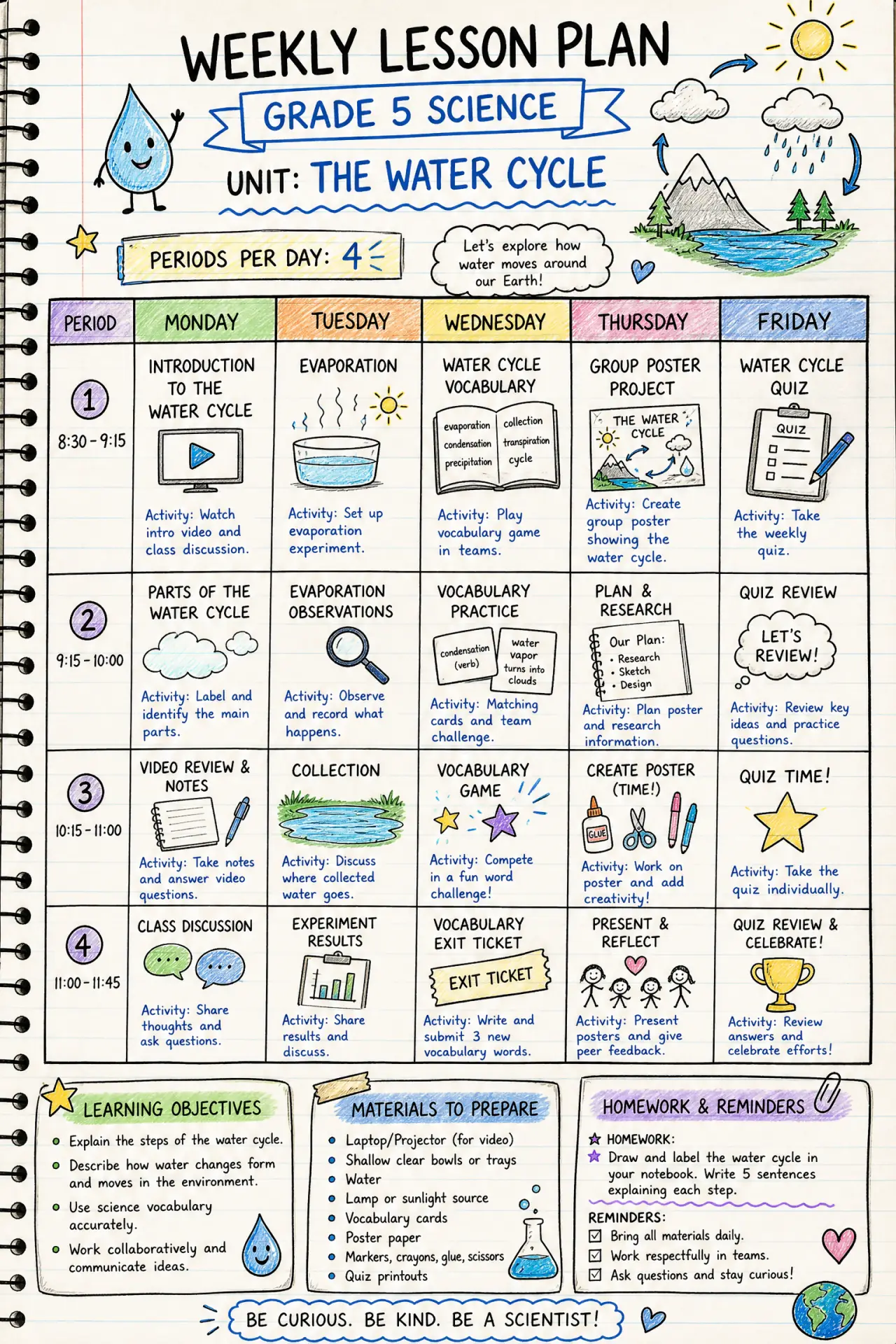
Weekly Lesson Plan
A full teaching week on one page: objectives, activities, materials and homework. Print the blank grid or let AI draft it from your unit.
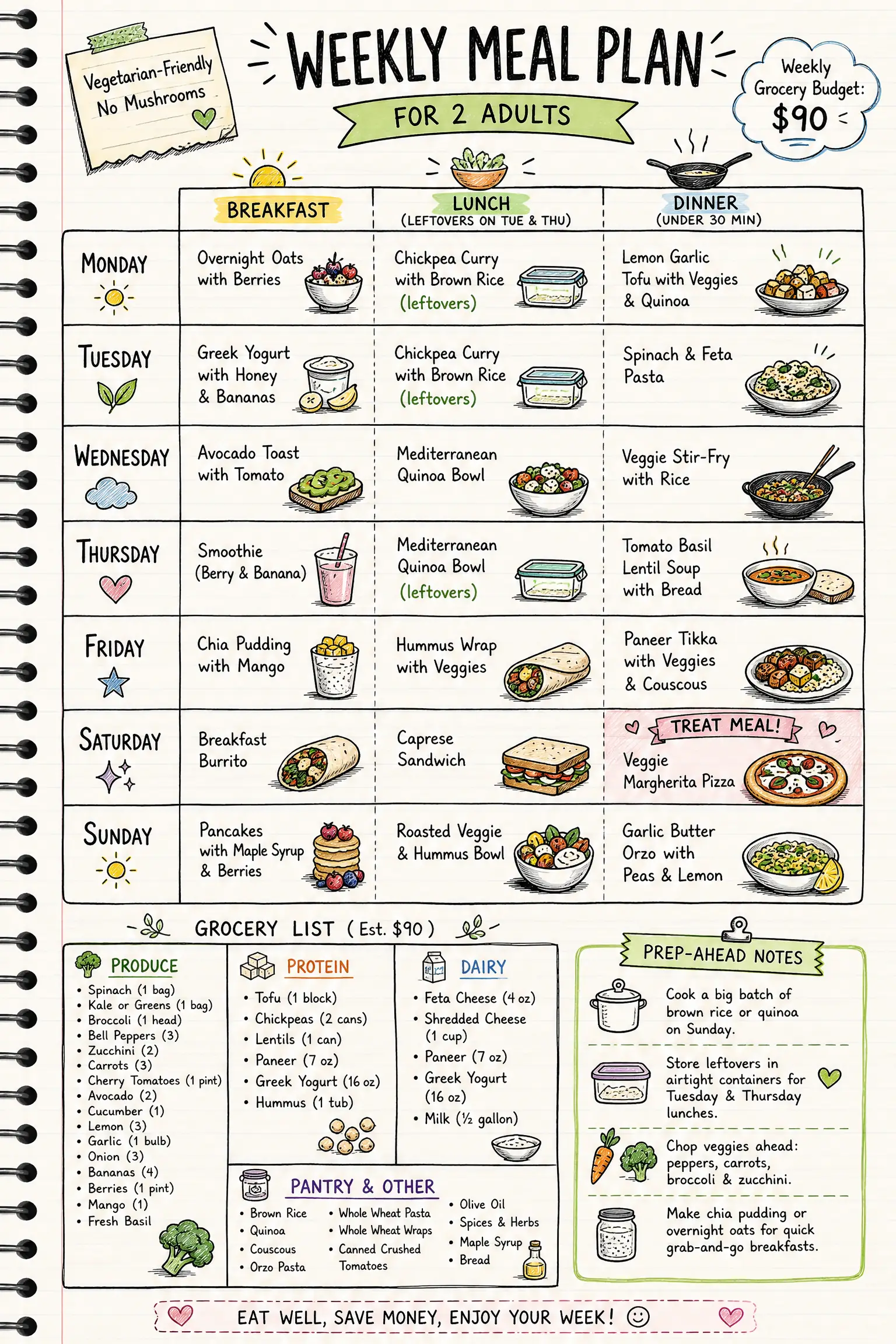
Weekly Meal Planner
Plan seven days of breakfasts, lunches and dinners with a matching grocery list. Print it blank, or let AI fill it in from your diet and budget.
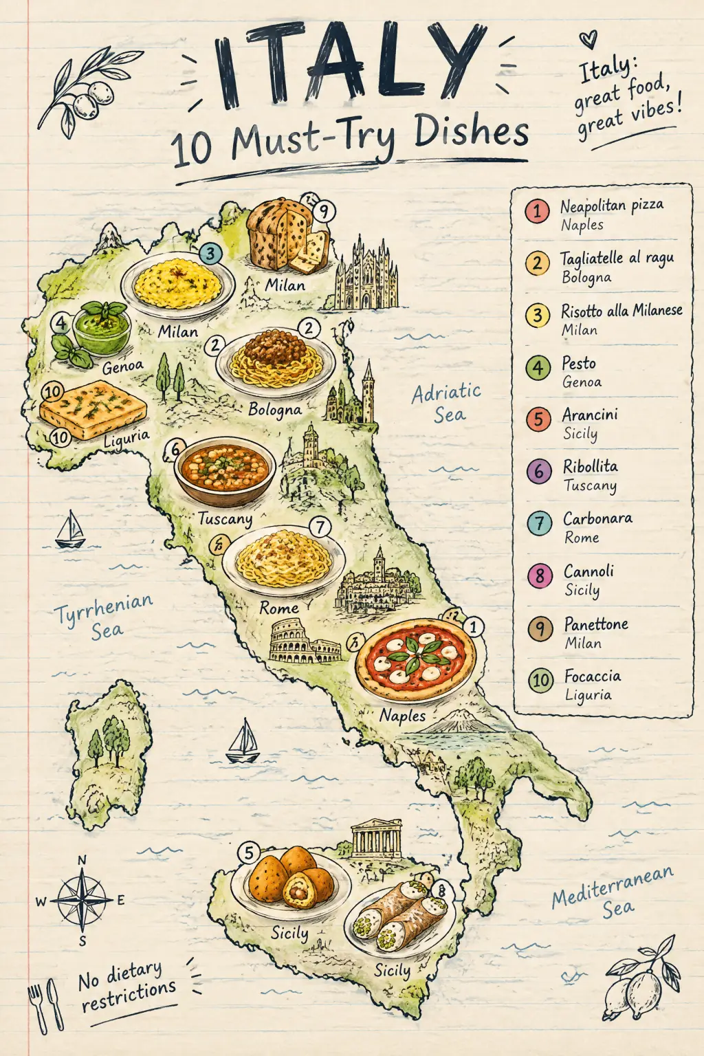
Local Food Map & Dish Checklist
Plan what to eat in any country or city with a printable food map and dish checklist, or let AI draw an illustrated food map of your destination.
Frequently Asked Questions
Do hand-drawn infographics look unprofessional?
Can I use the hand-drawn style for data-heavy infographics?
Create Your Hand Drawn Infographic
Describe any topic, and AI generates a polished Hand Drawn infographic in seconds. No design skills required.
Start Creating — Free