

How to Choose an Infographic Style: 14 Styles Compared
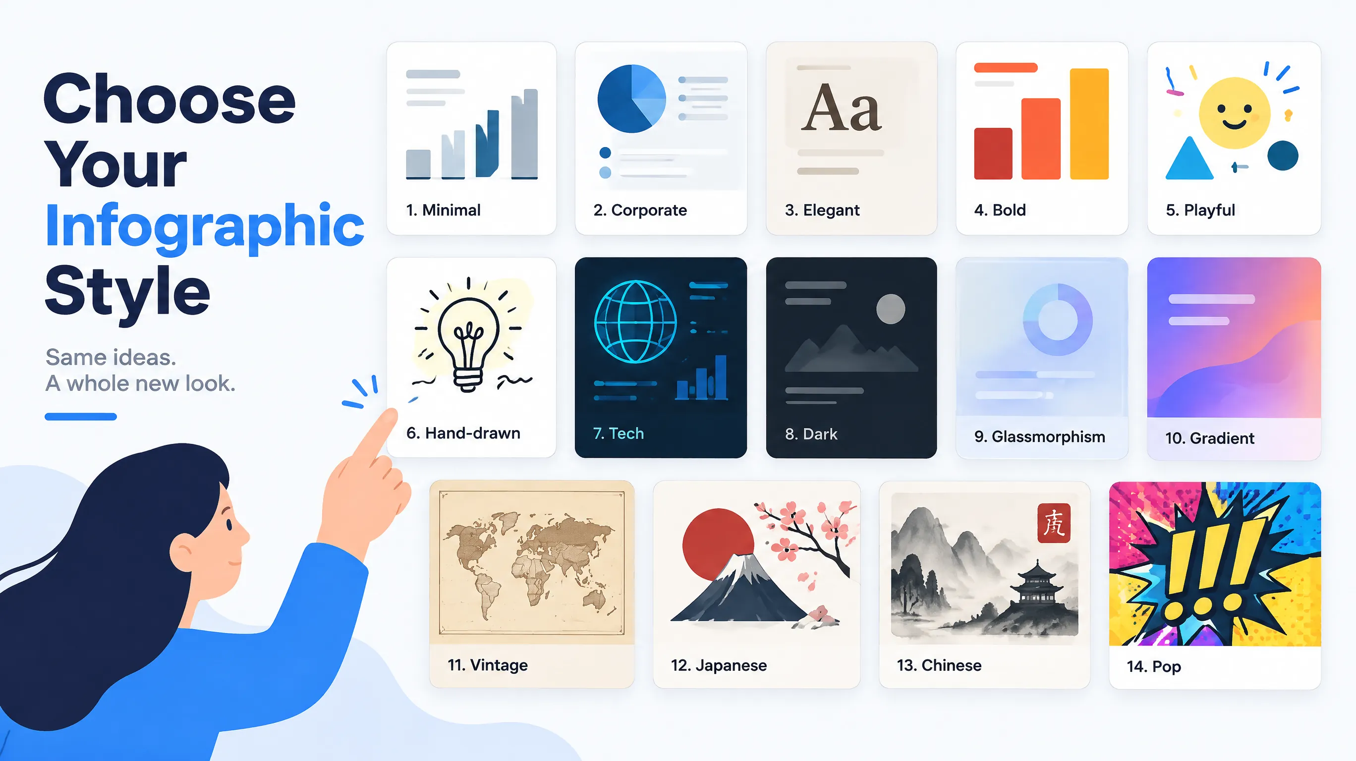
Why Infographic Style Matters More Than Most Teams Expect
Two infographics can contain exactly the same data and still produce very different reactions. One looks credible and gets shared in a board deck. The other feels playful and gets pinned to a classroom wall. The difference is style: the combination of color, typography, texture, and layout density that tells readers how to interpret the content before they read a single word.
Choosing a style is therefore a communication decision, not a decoration decision. A mismatch quietly undermines your message. A cybersecurity checklist rendered in pastel cartoons may look unserious, while a children's nutrition guide in a dark neon theme may feel hostile. This guide gives you a simple method for picking among the 14 styles available in our style library, with examples of when each one works and when it does not.
A Four-Question Method for Picking a Style
Before browsing any gallery, answer four questions in writing. It takes five minutes and prevents most style regrets.
- Who is the audience? Executives, students, customers, and general social media followers each expect a different level of formality and information density.
- Where will it be seen? A slide projected in a meeting needs high contrast and big type. A Pinterest pin competes with thousands of other images and needs a strong visual hook. A printed handout needs to survive grayscale.
- What is the emotional tone? Authority, warmth, energy, calm, nostalgia, and urgency all map to different visual languages.
- How much data is there? Dense comparison tables need clean, quiet styles. A single headline statistic can handle louder styles with more decoration.
Once you have answers, the style choice usually narrows to two or three candidates, and a quick side-by-side test settles the rest.
The Professional Group: Minimal, Corporate, and Elegant
Minimal uses white space, thin lines, and restrained color to let data lead. It is the safest option for dashboards, quarterly reviews, and research summaries. If you are unsure, minimal rarely fails, though it can look generic when you need to stand out in a crowded feed. See it in action with the minimal quarterly report template.
Corporate relies on structured columns, navy and gray palettes, and conservative typography. It signals authority and works well for annual reports, investor updates, and internal communications. The tradeoff is that it can feel cold for consumer topics.
Elegant adds cream backgrounds, serif type, and gold accents. It suits premium products, hospitality, and luxury market reports, such as the elegant wine guide template. Use it when perceived quality matters more than raw data density.
The Attention Group: Bold, Gradient, and Pop Art
Bold uses thick shapes and vivid colors to stop the scroll. It is ideal when one number or one claim must dominate, for example a headline statistic in a social post. Our social media marketing strategy infographic shows how large figures carry a message even at thumbnail size.
Gradient blends smooth color transitions across sections. It feels modern and energetic, which makes it a favorite for startup pitches, trend reports, and creative agencies. Keep text contrast high, because text over light gradient zones can become hard to read.
Pop Art adds halftone dots, outlines, and comic-style energy. It works for entertainment, music, and campaign launches, including our product launch campaign plan template. Avoid it for sensitive or highly formal subjects, where the playfulness can read as flippant.
The Friendly Group: Playful and Hand Drawn
Playful uses pastel colors, rounded shapes, and cartoon icons. It is a strong fit for education, children's topics, and health awareness, where approachability helps people engage with information they might otherwise skip.
Hand Drawn looks like pen-and-ink sketches. It conveys authenticity and works well for process explanations, personal stories, and creative content. Because the lines feel informal, it invites readers to follow a narrative rather than audit numbers.
The Technology Group: Tech, Dark, and Glassmorphism
Tech uses glowing lines and circuit-like patterns on dark backgrounds to signal innovation. It suits AI, security, blockchain, and engineering topics, as in the tech cybersecurity template. Pair it with topics like our cybersecurity best practices infographic when you want technical audiences to feel at home.
Dark uses near-black backgrounds with neon accents. It fits gaming, nightlife, and fintech brands with an edgy identity. Dark themes can look striking on screens but print poorly, so check the final destination before committing.
Glassmorphism layers semi-transparent frosted panels over soft gradients. It feels current and polished, which suits SaaS feature explainers and app showcases. Use it sparingly with dense text, since transparency can reduce legibility.
The Cultural and Heritage Group: Vintage, Japanese, and Chinese
Vintage brings aged paper textures, warm earth tones, and retro illustration. It is a natural match for food and beverage, historical timelines, and nostalgia-driven brands, as seen in the vintage coffee guide template and our coffee production infographic.
Japanese uses washi textures, ink brush strokes, and generous empty space. It brings a calm, refined feel to wellness, nature, and cultural topics, for instance the Japanese wellness template.
Chinese combines red and gold palettes with traditional patterns and modern layouts. It is well suited to Lunar New Year content, cultural features, and brands that serve Chinese-speaking audiences. Pay attention to cultural meaning when choosing colors and symbols, and avoid using the style as a generic exotic backdrop.
Matching Style to Channel
The same topic may need different styles on different platforms. On Pinterest, vertical layouts with high-contrast headlines and strong color usually perform best, which favors bold, gradient, and playful options. On LinkedIn, minimal, corporate, and elegant styles feel at home in a professional feed. In presentations, choose high contrast and large type, even if that means a quieter style than your brand might otherwise pick. In email, simple layouts with few colors load quickly and remain legible on small screens. For channel-specific sizing and posting strategy, see our guide to infographics for social media.
Three Real-World Scenarios
Scenario 1: A SaaS team explaining a new feature. The audience is existing customers and prospects scanning a product page. The goal is clarity and a modern feel. A glassmorphism or minimal style works well here, with one accent color that matches the product interface. A loud pop art treatment would compete with the product screenshots rather than support them.
Scenario 2: A school counselor sharing sleep and study tips. The audience is teenagers and parents, and the content will be printed and posted online. Playful or hand drawn styles lower the barrier to reading, and their light backgrounds print cheaply and clearly. A dark theme would look good on a phone but waste ink and reduce legibility on paper.
Scenario 3: A restaurant telling the story of its seasonal menu. The audience is diners who value craft and provenance. Vintage works because warm paper tones and retro illustration signal heritage, while a clean serif headline keeps the menu readable. The same content in a neon dark style would send the opposite message about the experience.
In each case the decision follows the same logic: start with who is reading, where they will see it, and what feeling the content should leave behind. The design then supports the message instead of competing with it.
Style and Color: Keep the Palette Intentional
Every style ships with a default palette, but you can adjust it to match your brand. When you do, keep to a small set of colors: one dominant, one or two supporting, and one accent for the key insight. Check contrast between text and background, especially for gradient and glassmorphism styles. If you want a deeper dive into palette decisions, read our article on color psychology in infographic design, and combine it with the layout fundamentals in infographic design tips.
Common Mistakes When Choosing a Style
- Choosing what looks trendy instead of what fits the audience. A style that wins design awards may still confuse your readers.
- Using decoration to compensate for weak data. Louder styles amplify a strong message but cannot rescue a vague one.
- Ignoring the final destination. Dark and gradient styles can lose contrast when printed or projected.
- Mixing styles inside one campaign. Consistency across a series builds recognition. Pick one primary style per campaign and use a second only for contrast.
- Skipping a side-by-side test. Generate your topic in two or three candidate styles and compare them at thumbnail size, since that is how most people first see your work.
A Quick Decision Table in Words
If your audience is executives and your goal is trust, start with corporate or minimal. If your goal is attention in a social feed, start with bold, gradient, or pop. If your audience is students or families, start with playful or hand drawn. If your topic is technical, start with tech or dark. If your topic is food, history, or heritage, start with vintage, Japanese, or Chinese depending on the cultural context. If you want a premium feel, choose elegant. These are starting points, not rules, and the best way to learn what works for your brand is to test.
Test Your Style Choice in Minutes
With an AI generator, testing is cheap. Write your topic and key data once, then render it in two or three different styles and compare them side by side. Ask a colleague which one they trust most, which one they would share, and which one they understand fastest. Their answers tell you more than any style guideline can. Ready to try it? Create your infographic and switch styles with one click, or browse the gallery for inspiration before you start.
Keep reading: Learn how to turn numbers into narratives once your style is chosen.
Create Your Own Infographic
Apply what you learned and generate a professional infographic with AI in seconds.
Start Creating — FreeRelated Articles
Infographic Design Tips: Colors, Fonts, and Layout Best Practices
Master infographic design with expert tips on color theory, typography, and layout. Create visuals that are beautiful, readable, and effective.
DesignColor Psychology in Infographic Design: Choose Colors That Convert
Learn how color psychology shapes emotion, readability, and engagement in infographics, with data-backed tips for choosing palettes that work.
DesignInteractive Infographics: Boost Engagement with Dynamic Data Viz
Learn how interactive infographics boost engagement over static visuals, with tools, techniques, and examples for dynamic data visualization.