

Infographic Design Tips: Colors, Fonts, and Layout Best Practices
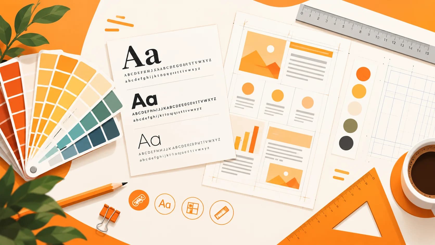
Design Principles That Separate Good from Great
Creating an infographic that looks professional requires more than good data — it demands thoughtful design decisions about color, typography, and layout. Even with AI handling much of the production work, understanding these fundamentals helps you evaluate output quality, provide better creative direction, and make refinements that elevate good designs into great ones.
This guide covers the essential design principles every infographic creator should know, with practical advice you can apply immediately regardless of your design experience level.
Color Theory for Infographics
Color is the first thing viewers notice and the element that most strongly influences emotional response. Getting your color palette right sets the tone for your entire infographic.
Building a Cohesive Palette
Limit your palette to three or four colors plus one or two neutrals. This constraint creates visual harmony and prevents the chaotic feel of overly colorful designs. A typical infographic palette includes:
- Primary color: Your brand color or the dominant hue that anchors the design
- Secondary color: A complementary shade used for accents and highlights
- Accent color: A contrasting hue reserved for call-to-action elements and key statistics
- Neutrals: White, light gray, and dark gray for backgrounds, text, and spacing
For data-heavy infographics like a renewable energy comparison, assign one color per category being compared and use it consistently across all charts and labels. Viewers should be able to identify which data belongs to which category by color alone.
Color Psychology and Context
Different colors evoke different associations. Blue conveys trust and professionalism — ideal for finance and healthcare content. Green signals growth and sustainability, making it perfect for environmental topics. Orange and red create urgency and energy, suited for marketing and call-to-action elements. Purple suggests creativity and luxury.
Match your palette to your subject matter and audience expectations. A playful, colorful palette works for consumer content, while muted tones suit corporate and academic contexts.
Accessibility Considerations
Approximately 8% of men and 0.5% of women have some form of color vision deficiency. Never rely on color alone to convey information — always pair color coding with labels, patterns, or icons. Ensure text-to-background contrast ratios meet WCAG AA standards (4.5:1 for normal text, 3:1 for large text). Tools like WebAIM's contrast checker make verification straightforward.
Typography Best Practices
Typography in infographics serves a different purpose than in documents. Text must be scannable at a glance, readable at various sizes, and hierarchically organized to guide the viewer through your content.
Choosing Font Pairings
Use a maximum of two typefaces: one for headlines and one for body text. Headlines work best in bold sans-serif at 24 to 48 points; body text in regular-weight sans-serif at 12 to 14 points. Avoid decorative or script fonts except for very short headline text.
Typographic Hierarchy
Create clear visual levels using size, weight, and color. Your title should be immediately dominant. Key statistics deserve large size, bold weight, and accent color. Increase line spacing to 1.4 to 1.6 times the font size for body text.
Layout and Composition
Layout determines how effectively your information flows. A beautiful color palette and perfect typography cannot save a poorly structured layout.
Grid Systems and Alignment
Work within an invisible grid and align all elements to grid lines. Maintain consistent margins (at least 40 pixels) and gutters between sections (24 to 32 pixels). Consistent spacing creates rhythm and makes complex information feel organized.
Visual Flow and Reading Path
Design for natural eye movement. Western audiences read top-to-bottom, left-to-right. Place your most important element in the top-left or center-top area. Use arrows and numbered sequences to guide viewers through process-oriented content.
Whitespace Is a Design Element
Resist the urge to fill every pixel. Whitespace gives your content room to breathe and helps viewers focus on what matters. If you have more content than fits comfortably, create a series rather than overcrowding a single piece.
Data Visualization Within Infographics
When your infographic includes charts or graphs, use bar charts, pie charts, and line graphs for most data. Avoid 3D effects that distort proportions. Place labels on or adjacent to data elements, start axes at zero, and use your accent color to highlight the most important number.
Icons and Illustrations
Icons turn abstract points into quick visual anchors, but only when they are used with discipline. Choose a single icon style — outlined, filled, or duotone — and use it throughout the piece. Mixing styles makes an infographic look assembled from leftovers even when the data is excellent.
Keep icon sizes consistent within a group and give each one a clear job: identifying a category, marking a step, or illustrating a statistic. If an icon needs a paragraph of explanation, it is decoration, and a label will serve the viewer better. Where possible, align icon colors with your palette so they reinforce the color coding rather than competing with it.
Illustrations and larger graphics deserve the same restraint. One strong focal illustration near the top can set the tone, while repeating small icons below it keeps sections visually connected. Too many large illustrations compete with the data and slow the reader down.
Designing for Mobile and Social Crops
Most infographics are first seen on a phone, often in a feed where they are cropped or shrunk. Design with that reality in mind from the start.
- Increase minimum text size. Body text that looks comfortable on a laptop can become unreadable at feed width. Test by viewing the design at roughly a third of its full size.
- Lead with the headline and hero statistic. The top third of a tall infographic is what most people see before deciding to open it.
- Use modular sections. If each block stands alone, you can export crops for different platforms without losing meaning.
- Protect the margins. Keep logos and important text away from edges, where platforms may trim the image.
Plan two or three aspect ratios in advance — tall for Pinterest and blog posts, square or four-by-five for Instagram and LinkedIn — instead of retrofitting after the design is complete.
A Five-Minute Design Review Checklist
Before you export, step back from the canvas and run through this quick review. It catches most of the issues that make infographics feel unfinished.
- Squint test: Blur your eyes. Can you still see the title, the most important number, and the overall section structure?
- Color check: Are there more than four main colors? Does every color have a purpose?
- Type check: Are there no more than two typefaces, with clear size steps between title, headings, and body?
- Alignment check: Do elements line up to the grid, with equal spacing between similar blocks?
- Contrast check: Is all text easy to read against its background, including text over images?
- Data check: Do labels, units, and sources appear next to the numbers they describe?
- Cut check: Is there anything you could remove without losing the message? If so, remove it.
Running the checklist takes only a few minutes, and repeating it on every project turns design principles into habits you no longer have to think about.
Common Design Mistakes to Avoid
A few errors appear again and again in infographics that feel off. Using too many fonts creates visual noise. Centering every block of text makes lists hard to scan. Placing text directly over busy imagery reduces legibility. Choosing decorative charts over clear ones makes comparison harder, not easier. Each of these is easy to fix once you notice it, and your design review should look for them first.
Matching Visual Style to Your Audience
Good design is appropriate design. The same data can be presented in very different visual styles, and the right choice depends on who will see it and where. A corporate style with structured columns and a restrained palette suits investor updates and internal reports. A minimal style with generous whitespace works well for executive summaries and research briefs. Playful or hand-drawn looks suit education, health awareness, and consumer-facing content where approachability matters more than formality.
When in doubt, consider how the viewer will feel in the first second. If your audience expects authority and precision, choose restraint. If they expect friendliness and energy, allow more color and personality. Then keep that choice consistent across a series so people recognize your work at a glance.
Start From a Proven Structure
You do not have to invent a layout for every project. Most effective infographics follow a small set of reliable structures: a headline block, a hero statistic, two to four supporting sections, and a footer with sources and branding. Starting from a structure like this lets you spend your effort on the message and the data rather than on reinventing composition each time. Save your best-performing layouts, note which formats suit which topics, and reuse them. Consistency across projects also makes your work easier for audiences to recognize and trust.
Apply These Tips to Your Next Project
Strong infographic design is a skill that improves with every project. Start by applying one or two principles from this guide — perhaps refining your color palette or improving typographic hierarchy — rather than trying to overhaul everything at once.
AI tools handle much of the technical execution, but your design knowledge determines whether the output truly serves your audience. Create your next infographic with these principles in mind, and explore our healthy eating habits example to see effective color, typography, and layout working together in a finished piece.
Keep reading: Go deeper on type with 15 typography tips for infographics.
Create Your Own Infographic
Apply what you learned and generate a professional infographic with AI in seconds.
Start Creating — FreeRelated Articles
Color Psychology in Infographic Design: Choose Colors That Convert
Learn how color psychology shapes emotion, readability, and engagement in infographics, with data-backed tips for choosing palettes that work.
DesignInteractive Infographics: Boost Engagement with Dynamic Data Viz
Learn how interactive infographics boost engagement over static visuals, with tools, techniques, and examples for dynamic data visualization.
DesignInfographic Design Trends and Best Practices for 2026
Top infographic design trends for 2026: AI-assisted layouts, 3D data visualization, accessible design, and interactive storytelling formats.