


Renewable Energy Source Comparison
Futuristic data visualization comparing solar, wind, hydropower, and hydrogen energy sources across cost, efficiency, scalability, and environmental metrics. Ideal for energy sector reports and sustainability presentations.
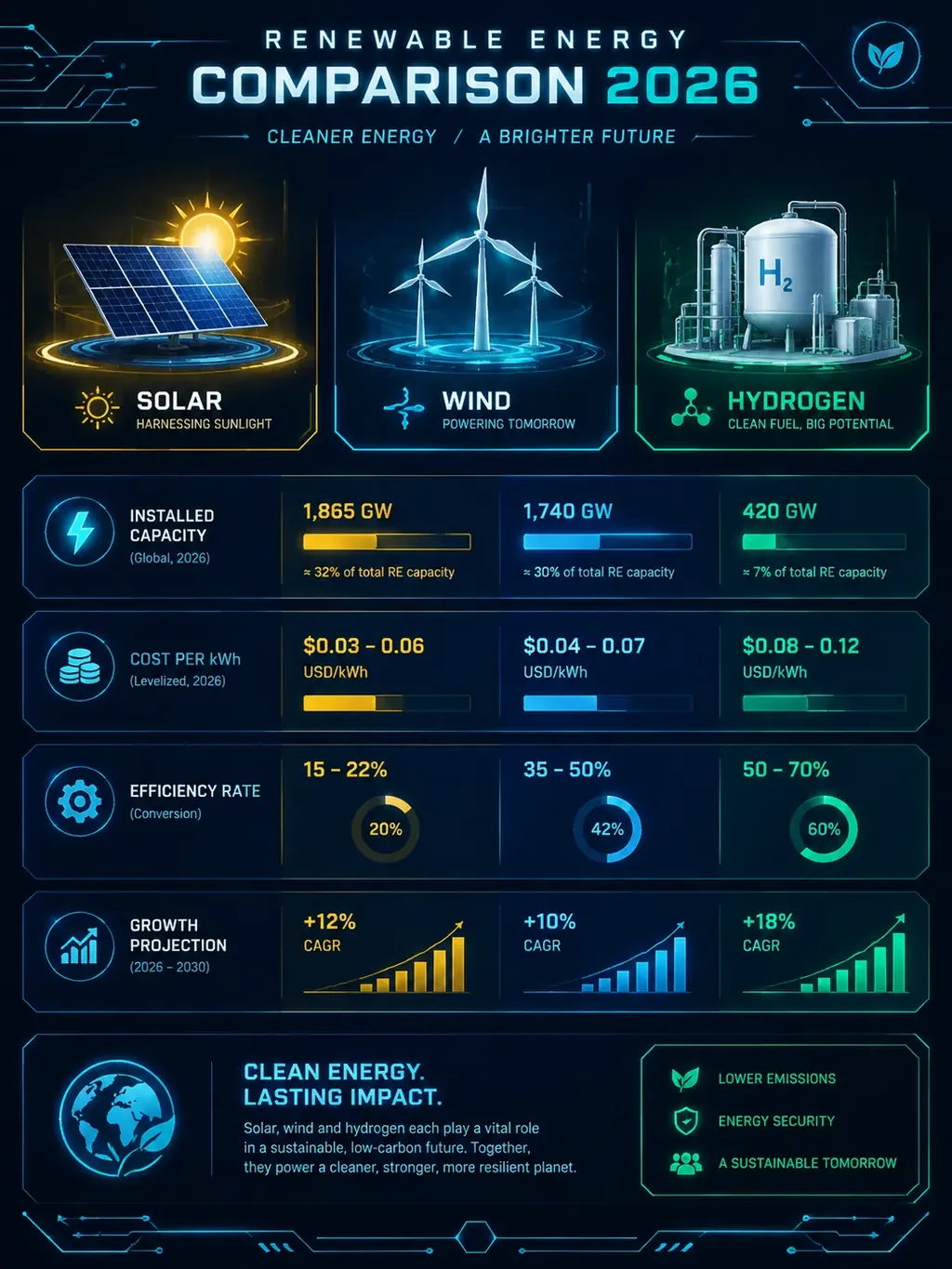
Generate this infographic with AI
Pre-filled with the Renewable Energy Source Comparison topic in Tech style — customize and generate in seconds
Use This TemplateWhy Use a Renewable Energy Source Comparison Infographic?
Energy transition decisions affect trillions of dollars in infrastructure investment, yet most renewable energy comparisons are either too simplistic (just listing pros and cons) or too technical (buried in engineering jargon). This template bridges the gap with a data-rich but visually accessible comparison that policymakers, investors, and business leaders can use to make informed decisions. The tech style with glowing data panels and circuit-line aesthetics signals innovation and forward thinking — perfect for the clean energy sector. Searches for 'renewable energy comparison infographic,' 'solar vs wind cost comparison,' and 'clean energy data visualization' are high-intent queries from people actively evaluating energy investments, making this template a strong SEO asset for sustainability and energy organizations.
Best Practices for Renewable Energy Source Comparison Infographics
Key Metrics to Include
Make your renewable energy source comparison infographic data-driven by including these essential metrics:
About the Tech Style

Tech — Futuristic, data visualization
Glowing cyan circuit lines on dark backgrounds with holographic overlays. Built for AI, cybersecurity, blockchain, and technology topics. Conveys innovation and cutting-edge thinking.
Browse all Tech templatesHow to Create Your Renewable Energy Source Comparison Infographic
Click Use This Template
The AI generator opens with the "Renewable Energy Source Comparison" topic and Tech style already selected. The prompt includes relevant data points like levelized cost of energy (lcoe) per mwh by source and capacity factor percentage by source and region.
Add Your Own Data
Replace the sample data points with your actual numbers. Lead with a normalized comparison table (LCOE in $/MWh) so readers can immediately see which energy source is most cost-effective for their region and use case.
Generate & Download
Hit Generate and your infographic is ready in seconds. Download the high-resolution image for social media, presentations, or your website.
Ready to Create Your Renewable Energy Source Comparison Infographic?
No design skills needed. Just customize the topic and let AI do the rest.
Use This Template — FreeRelated Templates

AI/ML Pipeline
Tech style · Technology
Futuristic data pipeline visualization showing data ingestion, model training, and deployment stages.
Cybersecurity Framework
Tech style · Technology
Threat landscape overview with attack vectors, defense layers, and best practices for IT security.

Space Exploration Milestones
Glass style · Science
Modern frosted-glass visualization of humanity's greatest space achievements. Key missions, rocket comparisons, planetary exploration status, and upcoming missions — perfect for science educators, astronomy enthusiasts, and STEM content creators.